Splinterlands Art Contest - Week 364 - Queen of Crows

Hey there. I hope you're having a pretty nice day so far. It's already been a week (actually 9 days since my last Splinterlands Art Contest entry), and it is time for this week's entry. I decided to go for the queen of crows for this week's contest
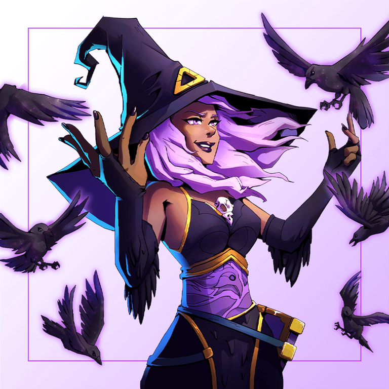
For this piece, I wanted to create something dazzling, yet not too bright. You could call it being on the evil side, but not quite evil. A dark witch, but not evil, if you catch my drift - I'd avoid Liza the Dark at all costs tho (for how dark she is for this piece that I had in mind). That's when I thought Queen of Crows would be a great fit for this, and I chose to draw her in a not-too-dark and gloomy atmosphere.
Also, as much as I love crows and how smart and mischievous they can be and practically are, I left the crows out of this piece, since, again, many people mistakenly take them as bad omens and don't like them to be around as much. And in hindsight, I think they would have made the drawing look a bit crowded (CROWded... get it? :D) and perhaps not too beautiful.
Well, this is it for the art overview for this piece. With that out of the way, let's just jump right into the details of it. For those of you on the more nerdy side, just like me, keep on reading, and for those interested in only the steps, feel free to open the gallery and see the transformation.
The Process

For the initial coloring stage, I used the three primary colors in her palette to fill the line art. (Not counting the skin color, since, why would I :D)

Then I proceeded to add a flat dark background color (a dark blue) and added some highlights on her black clothes to introduce some contrast and 3D-ness to the piece.

After having seen the dark background next to her hair, I thought a darker shade of purple would look better on her, so I just applied that.

Then I adjusted her skin color and worked on contrasting more between the different parts of the same piece of clothes or hair, and so on.

And the background felt so lonely and empty, that's why I added some blurry lights in the back to make it more interesting...

The Result
And last but not least, I added the diagonal holy light coming from the top left. Then the sparkles around the drawing in the background and particles on the subject to add some of the final dazzle. And I do believe the final light pillar's addition was somewhat necessary since that kind of light source was needed in the drawing to justify the rays of different light in her hat's golden lining.
Additionally, the piece would have appeared somewhat blurry and cloudy, ultimately gloomy and dark, without it, which would have ruined the initial point and goal of this piece altogether.
Other than the light pillar's addition, I also did some color correction and enhancement here and there, as you can see how her skin color went to become more of a human-like (read it as witch-like) skin color. But I think the lighting and particles were the more important addition, so let's just suffice to mention that and finding the other detail changes are left as homework haha (yes, I would have become that kind of annoying teacher)

Original Game Art
And here's the original game art for those curious:
And that's it for this week's Contest entry. Thanks for sticking through till the end, and I hope you enjoyed it as much as I did drawing this piece. Feel free to leave your thoughts and opinions and even suggestions on this piece in the comments down below, and I'll see you all in next week's contest... cheers~~
https://x.com/AlienArtHive/status/1971926706455031890
Thanks for sharing! - @cieliss
